Welcome to Foodics’ Behind the Pixels (BTP) series where we dive into the process we took to design the solutions that enhance your experience the next time you visit a restaurant near you.
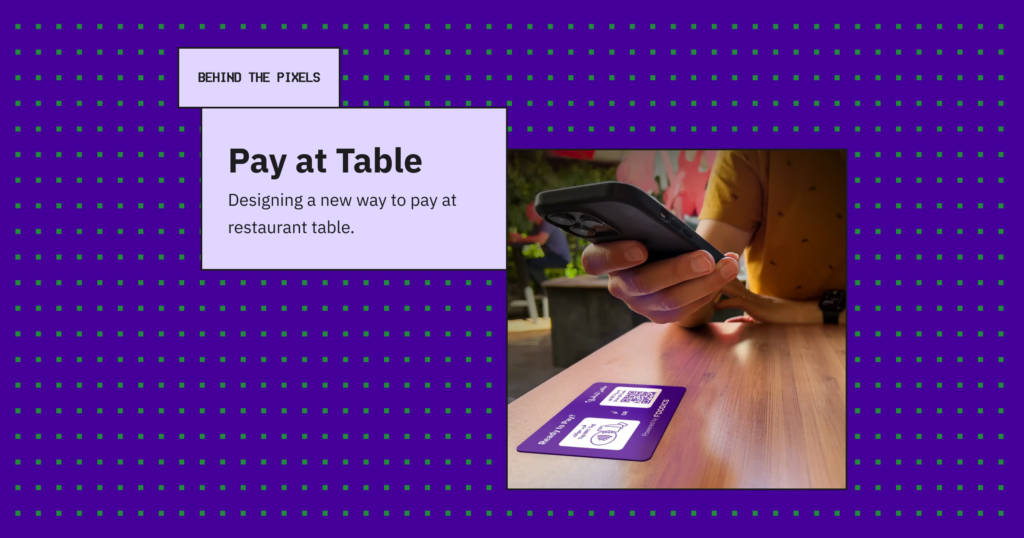
We’ve all been there, waiting around after your meal to try and catch the waiter’s attention for the bill. To do that slightly awkward hand wave gesture. Sometimes this can be a bit of a mood killer after an otherwise enjoyable experience. So why not fix that problem altogether? We heard you and introduced Pay at Table.
💳 Pay at Table
Pay at Table allows restaurant visitors to view and pay their bills right from their table, minimizing the need to get the waiter’s attention or call them after a meal to bring the bill. Each Foodics product is a step toward digitizing the customer’s experience to enhance the restaurant’s overall experience. Our product decisions are deeply embedded in the needs of our clients and their customers.
Every project starts somewhere, and so did ours, with a Google Sheet to gather all the requirements that a Pay at Table experience must fulfill. We looked at different competitors offering a similar solution for the restaurant space like Sunday, Qlub, and Spades to name a few. Through this competitor analysis, we better understood how the market is working, what user needs are fulfilled, and what is lacking.
Get it to flow, like a pro
To start off we had to make it flow right. Before making a single pixel work we gathered all the user needs that we were solving for and made a full-depth user flow that encompasses the end-end flow for each and every interaction that users are going to do with the solution.
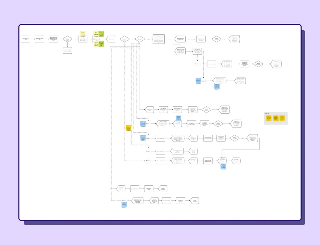
This helped us uncover many areas that needed further exploration. We triggered the dead-ends and error areas early on.
Making the end-end flow also helped in opening the conversation on how we are solving this with the cross-functional teams of PMs and engineers.
Soon after we had discussions with the cross-functional teams, we were confident to move forward, as the bottlenecks and many error areas were solved early on. These conversations also helped in figuring out the technical feasibility, and let developers start figuring out the architecture.
Understand the browsers
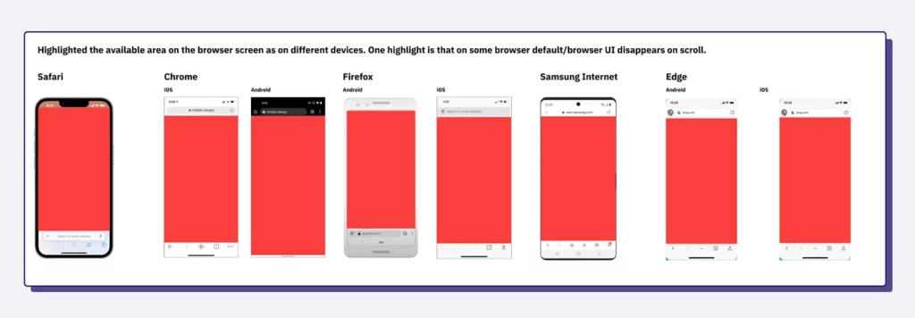
Pay at Table is not a mobile app that users install — but it is a web app that is accessible only by scanning the QR code placed on the restaurant table. This was an interesting challenge to see how different browsers give space to the content. To understand this, we looked at the browser usage stats in our available markets and also studied different mobile browsers. We wanted to be sure that our designs, placement of elements, and content are easily accessible on different browsers.
From our research, we found that Google Chrome is the most used browser in the region followed by Safari. We also found that Android captures roughly 60% of the market. We also studied what different screen sizes are most common in the region, to be very sure that we set a foundation that can work on many different devices.
Take it to the screen
When we had a flow in place and we knew what different interactions and tasks the users would be doing, we knew it was time to map. We quickly wireframed ideas to start seeing the layout of the app. The wireframes helped in laying out the interface and forming a foundation for what will go on screen and where. This articulated and solidified the ideas into tangible screens.
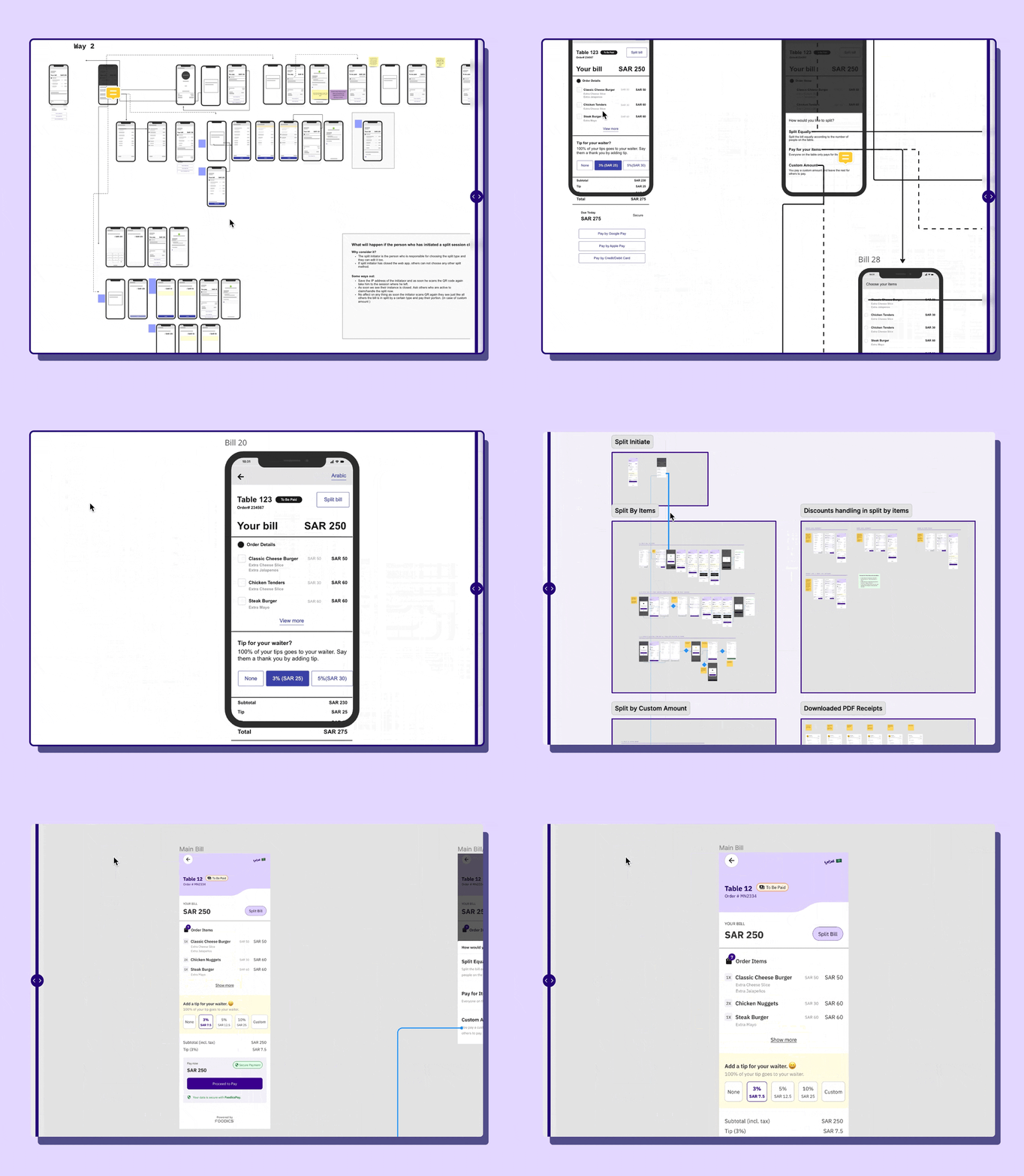
The visual design process was super fast thanks to our design system (more on it very soon). Relying on the base we have set for a multi-device framework helped in leveraging the components from there to be used and instantly iterating and solving the problems instead of spending endless time fine-tuning that button.
Taking it to the test
At Foodics we run usability tests very often to catch problems early on. With the unique nature of this product, it can be used by one person or multiple persons at the same time. They can pay the full bill themselves or can split it in three different ways. We wanted to understand if the designs, copy and everything else are understandable for different tasks.
We conducted remote usability testing but with a twist. We wanted to replicate the real-life use case of multiple people splitting the bill, so we tested in groups. We checked how the real-time updates help them know the latest with their bill and reflect the latest amounts and splits to everyone on the table. We recruited people from different departments within our company to test this.
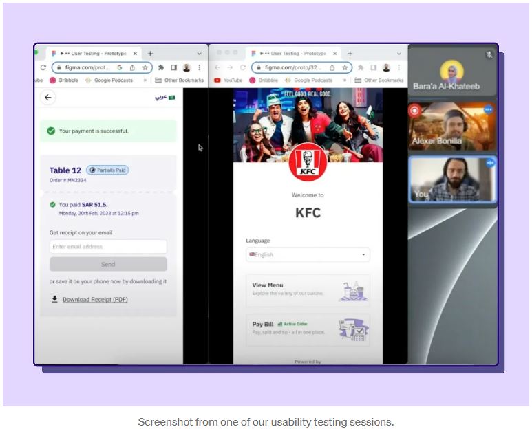
We document everything on Notion. Soon after we finished our usability study we documented the sessions along with the improvements we found out to do. We redesigned a few screens, rewrote the copy in many places, and introduced affordances in some places.
✌️A sneak peek
Let’s look at some bits and pieces from different parts of the solution. Because we would love you to notice the details.
Little joys
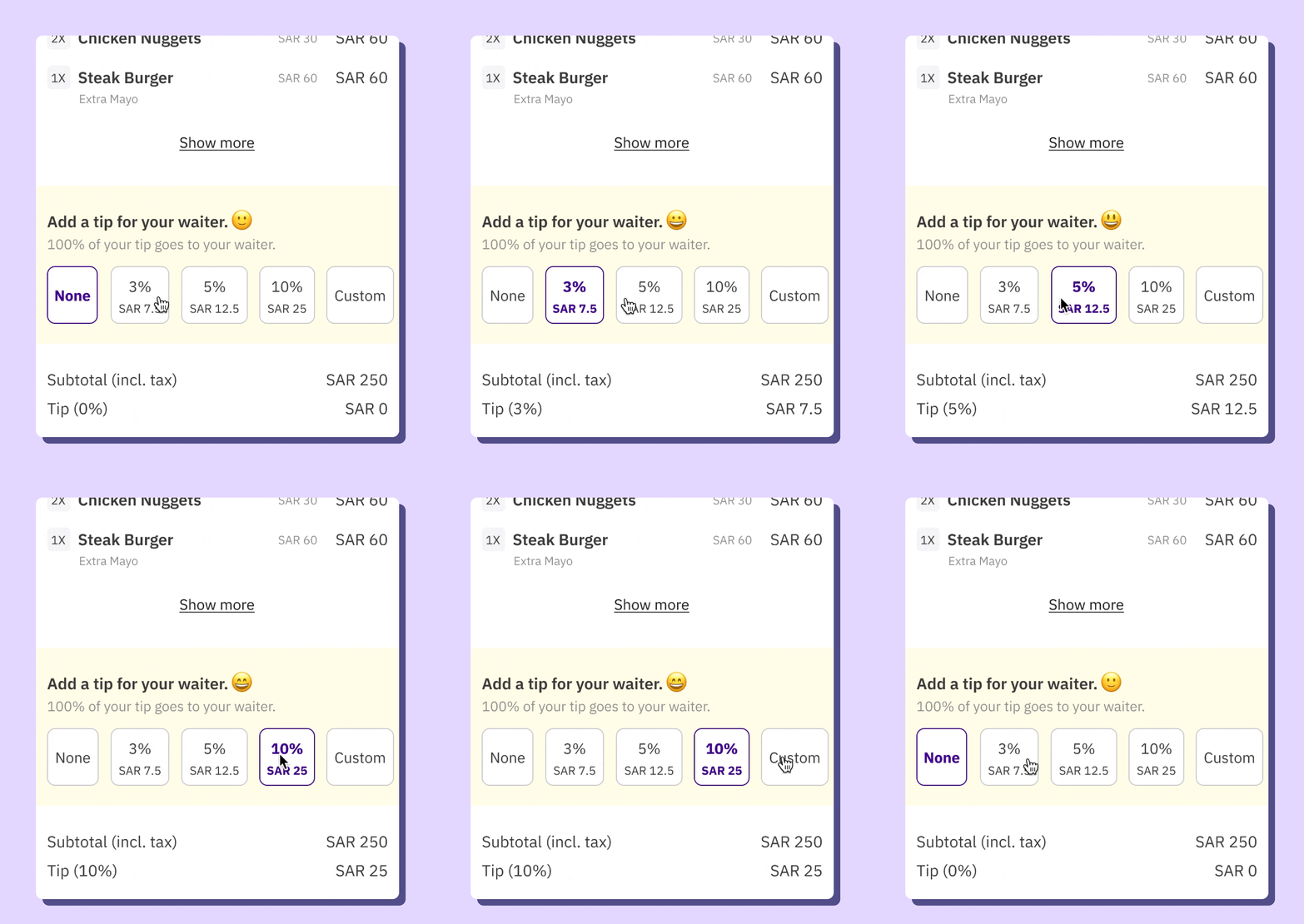
Software should be fun and to make ours a little fun too we animated the emoji in tipping to change as the user picks different tips. We are hoping that changing the tips and the higher one picks the happier they see the waiter is can entice users to tip more.
It is not a primary goal of ours to increase tips, but if this small element can help positive behavior, we believe it is good to have.
Stay in sync with others
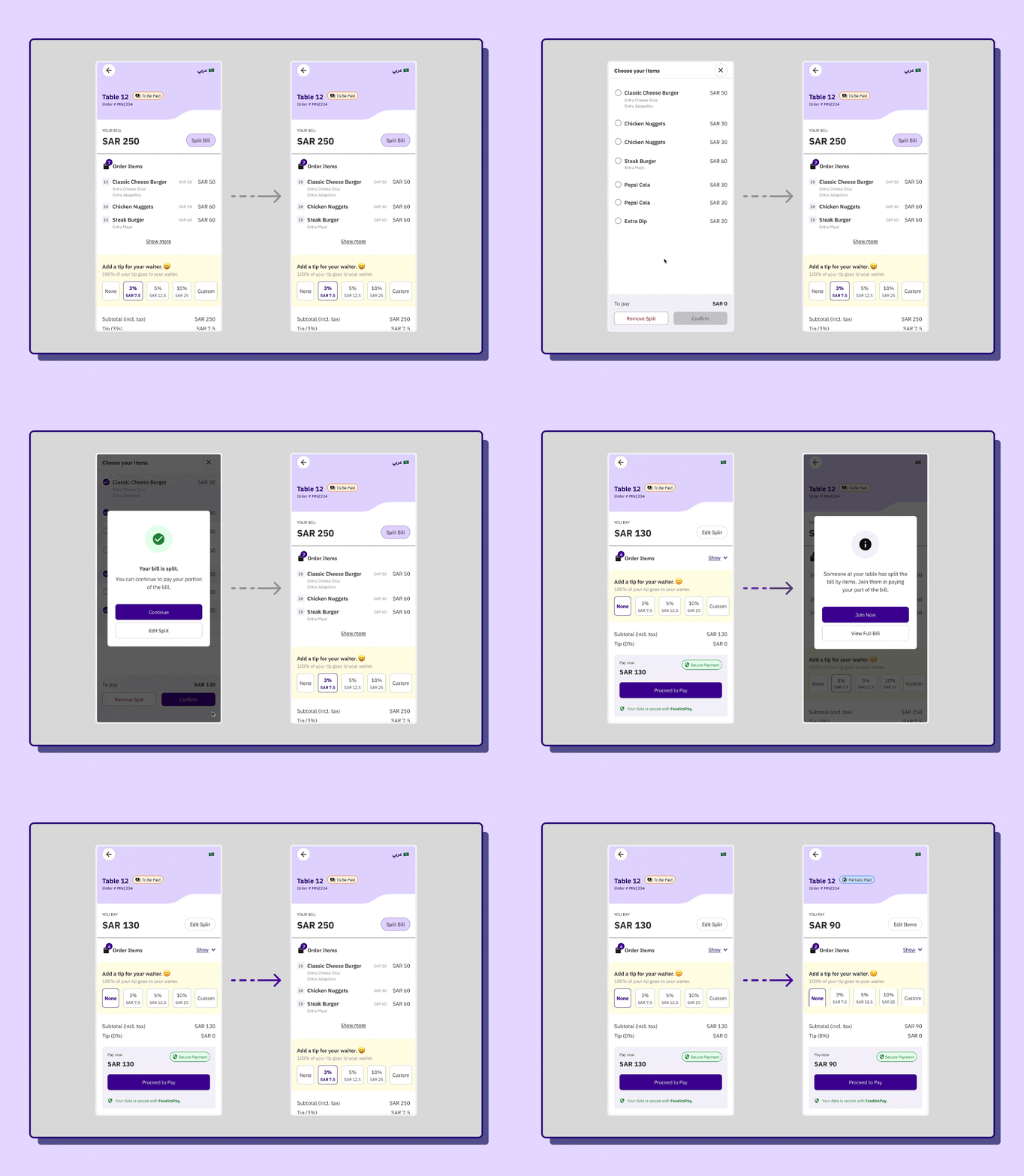
A major problem that other solutions in the market had was the overpayments that users make when a bill is split. Those solutions do not update others on the table if someone has split or paid a portion of the bill, which results in overpayments.
We solved it with real-time updates across all the devices that are viewing a bill. We collaborated with engineering immediately on this direction and through our brainstorming exercises we came up with an architecture and solution that solves the problem by syncing all the instances in real time and posting updates between devices. We have been able to do it without taking any extra data from the users. So you eat in a group of 5 or 15, and no worries about overpaying your bill and getting frustrated.
In your language
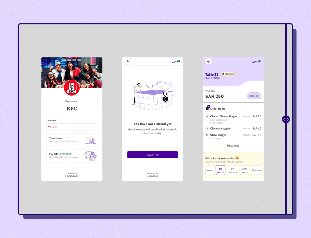
Our user base is diverse and in the region where we operate the two most common languages are Arabic and English. We have given support for both languages in our solution and a user can easily switch between the two. From the design side supporting the RTL interface along with the components shift was a good initiative. We design components to be used in both languages with some components with states that specifically require an alternate to support the RTL interface.
Multiple devices supported
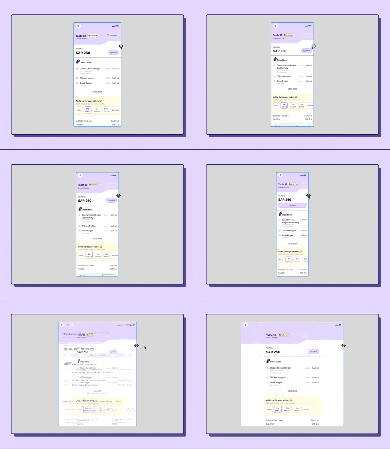
Mobile devices are expanding their variability with the release of new screen sizes every now and then. From tablet screens, and portrait and landscape modes, to the external screens of new folding phones, we had to consider every little detail and support as many screen sizes as we could. This was an interesting exploration to see how new mediums and screens for interaction are forming new complexities for the UI design and how designers need to solve for many different screen sizes.
Restaurant’s brand, integrated
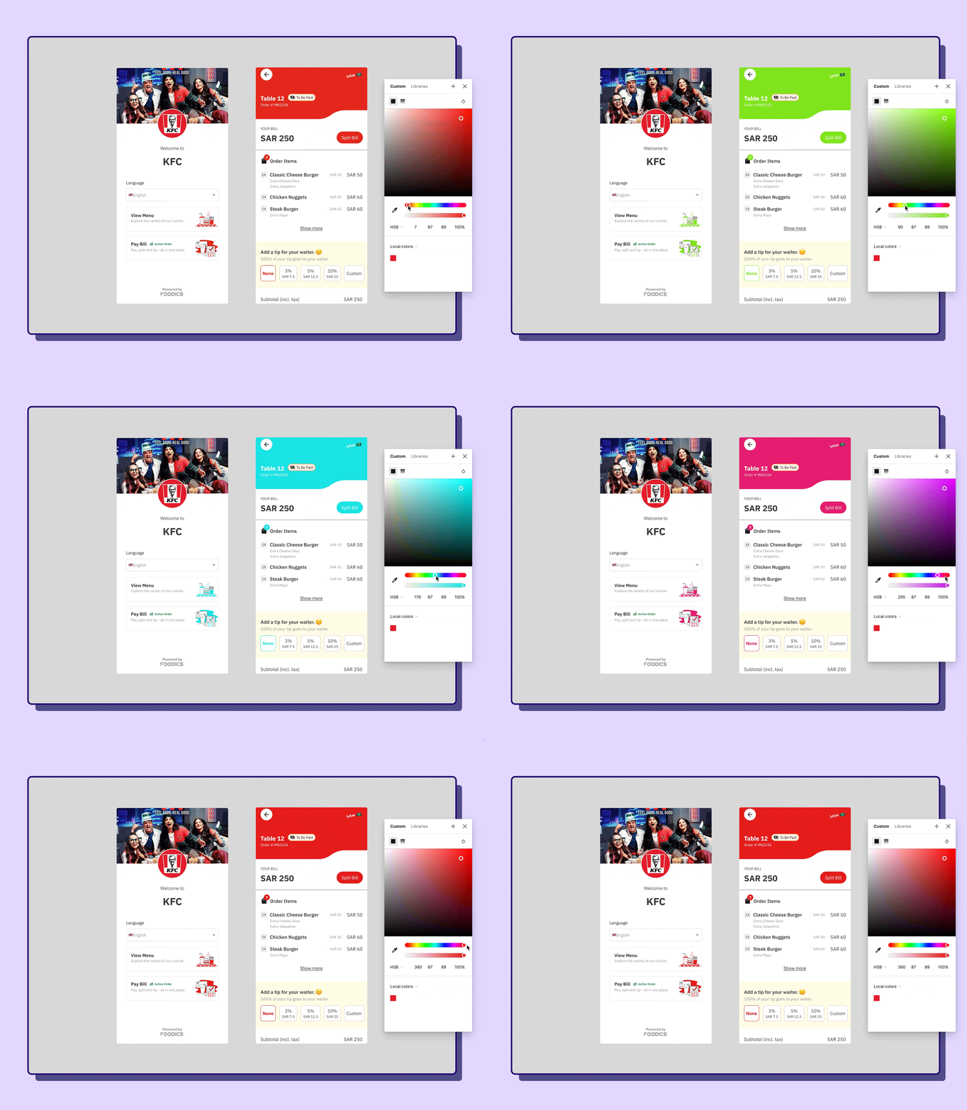
A customer’s experience with the Pay at Table solution at any restaurant is elevated when they see the branding of that restaurant in that solution too. We offered control to the restaurant managers to pick their cover photos and logos and apply their brand colors to certain areas of the product to make it their own. These customizations are to be further enhanced in the coming releases to offer more granular controls to the restaurants to make Pay at Table a solution that feels exclusively designed for their restaurant.
Using color styles helped in offering better customizations and specifying areas where the custom color is to be applied. This also formed the alignment between design and devs to speak the same language and easier implementation.
🎓Learnings
- Involve cross-functional partners early in the process. People from different departments have insights and experiences of their own. Involving them and listening to their side of the story in beneificial to expand your own understanding and form a culture of collaboration in the company.
- Test early and often, to mitigate any bias the designers have toward their solutions. Seeing others use the designs helps us uncover more insights and ways the users will use your solution instead of how you want them to use it.
- Design to scale as soon there will be more features, requests, and updates will come to the solution so the base should be strong enough to accommodate the future picture.
Foodics is on a mission to design the future of restaurant management. But it is not complete unless we also care about every experience of customers with that restaurant. Solving for the business also means we are touching the experience of hundreds of visitors of many different kinds of restaurants, be it fine dining, fast service, or a food truck. We are not only making the restaurant businesses easy to operate but also making the experiences of restaurant visitors memorable.
This is our very first step in solving the table payments at a restaurant. As we explore this space more and learn from the current release of Pay at Table through behavioral research and going out in the field, we will be refining the solution and sharing our journey here with you all.
Till next time. 👋
